
 Featured Case Study
Redesigning a university
newspaper
Company
The Pulse / The University of Findlay
Platform
Editorial Design / Web Design / Graphic Design / WordPress
Role
Design Editor
Duration
August 2019 – June 2021
Tools Used
PhotoshopIllustratorInDesignAfter EffectsAdobe XDWordPress
Goal
During the onboarding process, I was tasked with refreshing The Pulse brand. I was given freedom to redesign the logo, the newspaper layout and implement responsive design changes to The Pulse's WordPress based website.
The goal of the project was to make the newspaper more recognizable and accessible to the University of Findlay's student population.
Key focus areas
━━ Modernize The Pulse logo for digital usage.
━━ Refresh the look of the print edition of the newspaper.
━━ Update The Pulse's social media brand.
Research
While joining this role, I decided to speak with the previous Design Editor to ask for guidance and brainstorm areas of improvement. We discussed the layout of The Pulse, the adaptability of the logo, and the lack of mobile responsiveness when it came to the website.
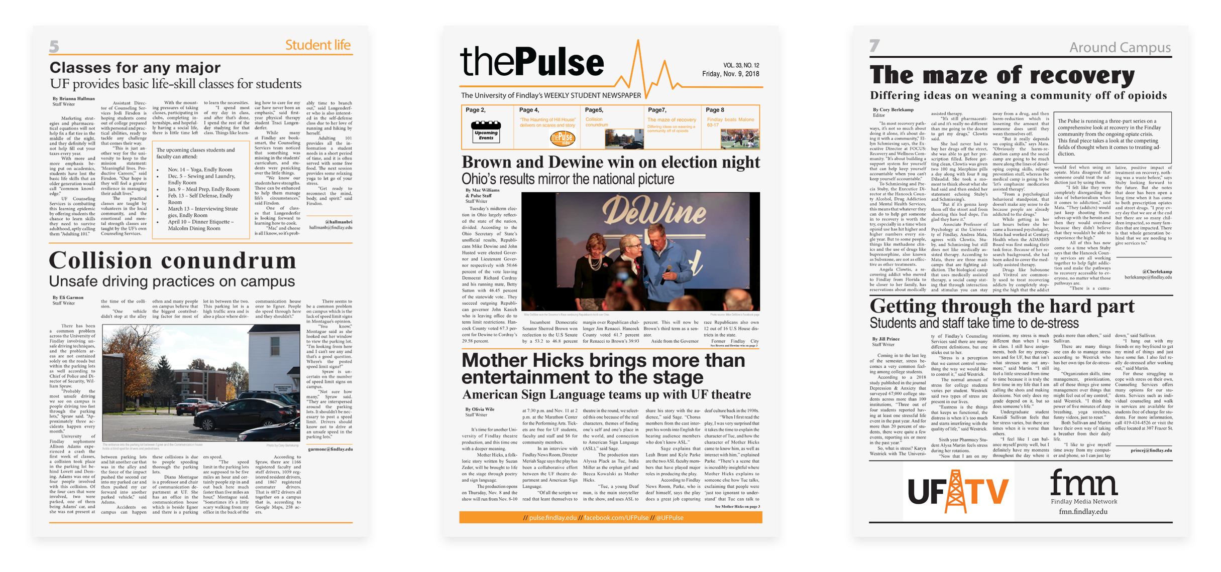
We identified four areas where the layout of the newspaper could be improved. Namely, item alignment, white space usage, font selection and styling consistency.
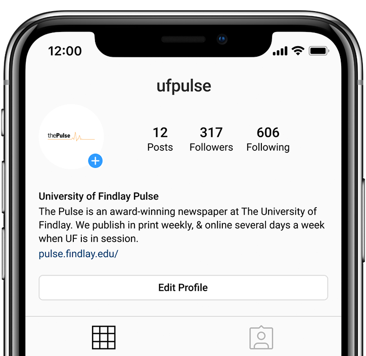
Logo analysis #1
The former logo fails to adapt to smaller sizes.
Ideation
Newer logos typically have variations that are easily deconstructed. For the redesign to be successful, we needed to identify the components that made The Pulse logo and deconstruct the original. Two areas were identified. The redesign could either focus on minimal typography or highlight the pulse icon. While consulting The Pulse staff, it was agreed upon that the component of focus should be the icon itself.

Logo analysis #2
Furthermore, while looking at other newspapers for inspiration, I noticed a common pattern of serif fonts incorporated in the logo design. I decided to explore this further in the design process.
Solution
An important requirement of logo redesign was the ability of the cardiogram symbol to be easily separated from the logo typography. In order to do so, the cardiogram symbol was encapsulated in a circle. The new form allowed it to stand on its own in situations where this was required. Additionally, this allowed for different variants of the logo to be easily created.
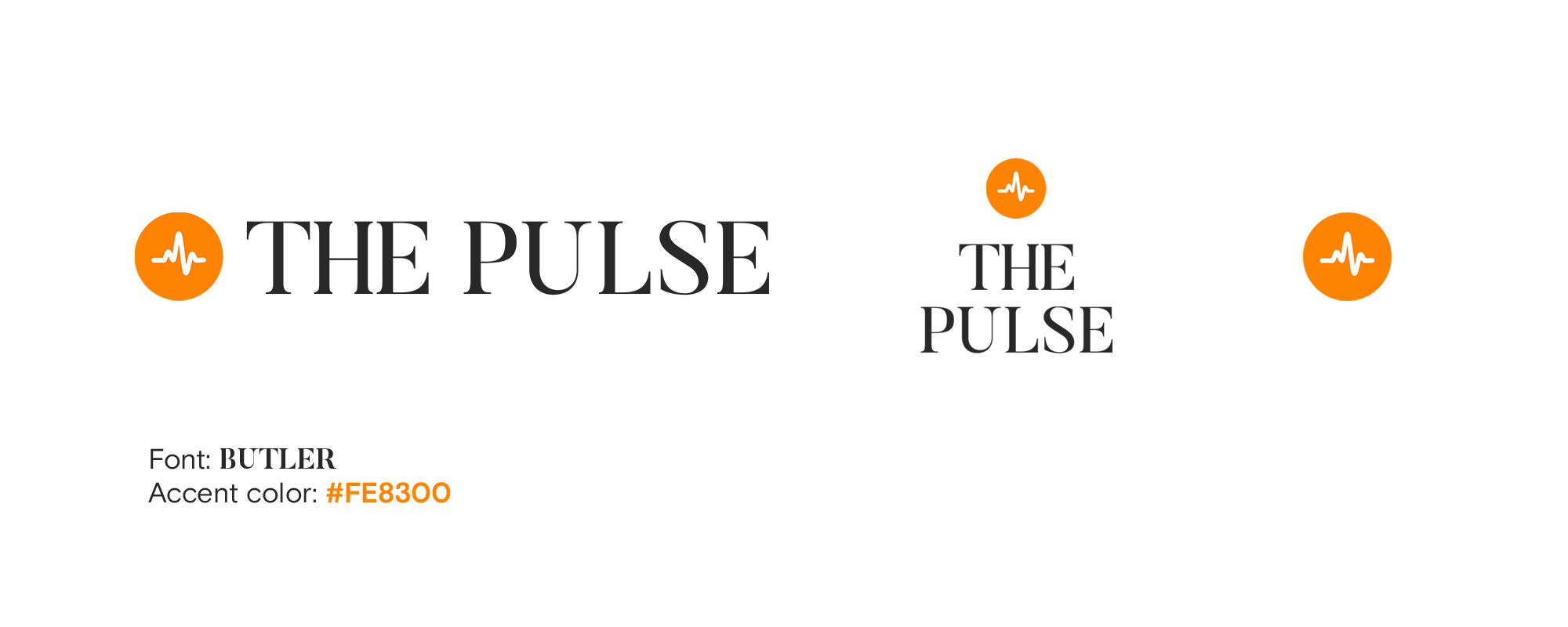
The Pulse logo redesign
The orange accent color used for the logo and throughout the magazine was inspired by The University of Findlay branding guidelines.
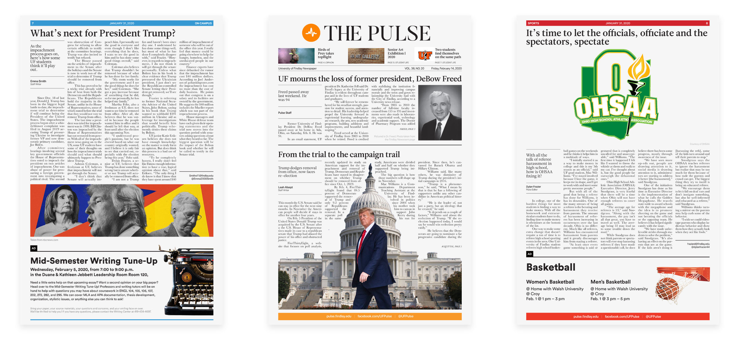
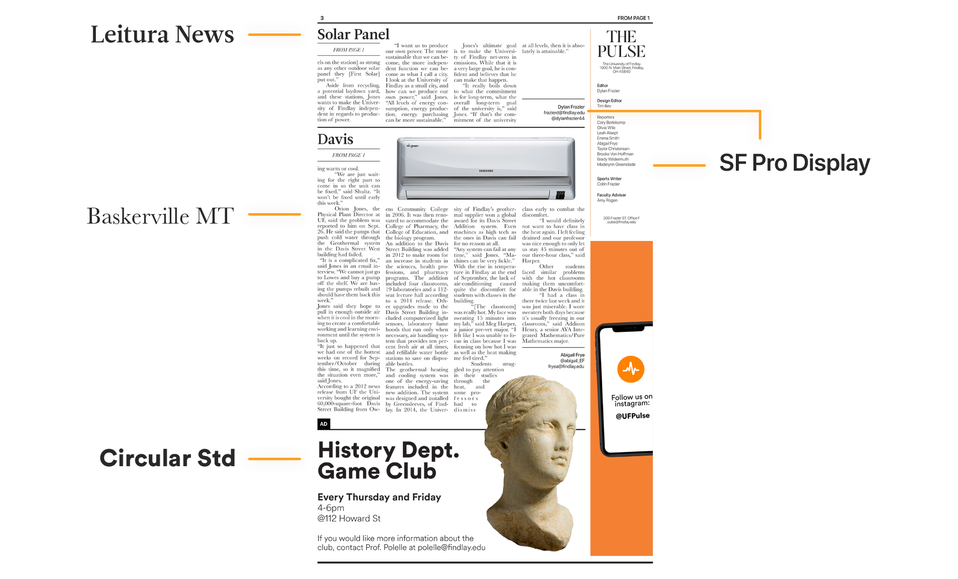
The Pulse newspaper redesign: Font selection
Leitura News Roman was used for all headers and sub-headers throughout the newspaper. Baskerville MT was used for all article text. Circular Std was used for The Pulse designed ads. Finally, SF Pro Display was the other sans-serif font, used mainly author attribution on articles.
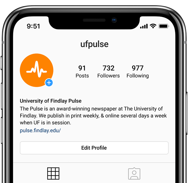
The new pulse logo: Instagram
The redesigned logo has variations that support smaller sizes.
Social media redesign
Along with the redesign of the logo and the layout of the newspaper, I also had the opportunity to work on the social media layout for The Pulse.
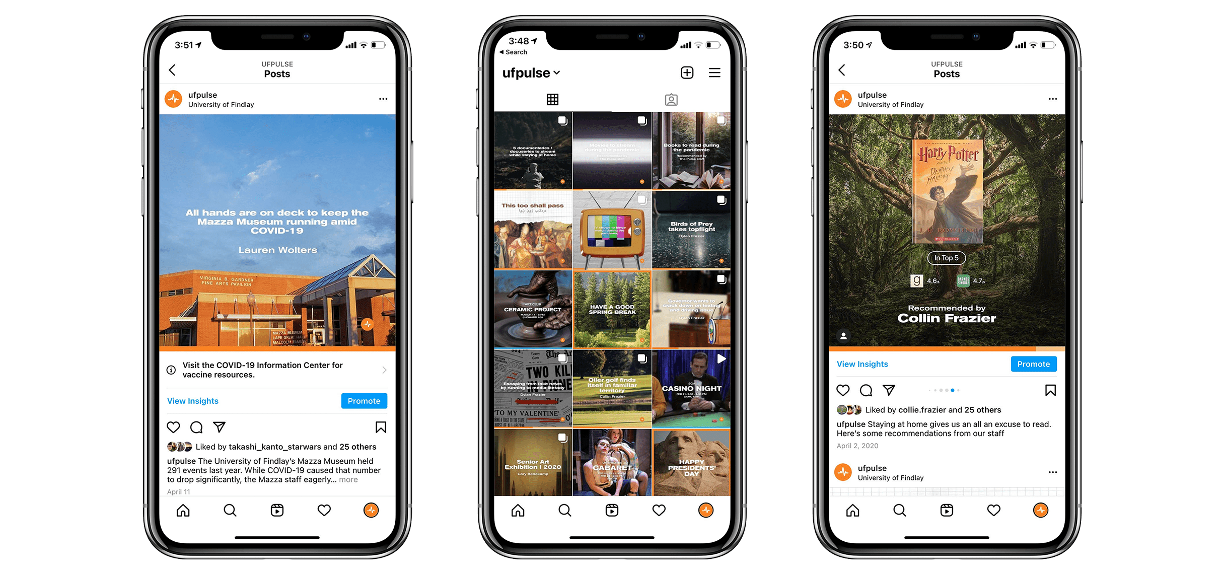
I had the liberty to experiment with different designs and establish the social media guidelines for the new Pulse brand.
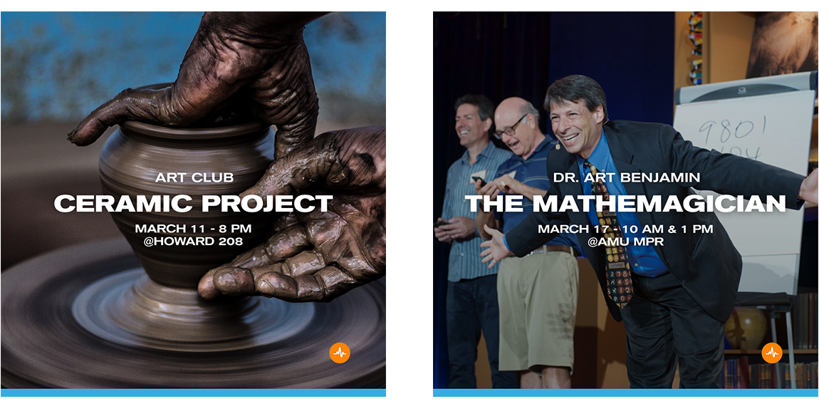
I decided to introduce three types of posts, being article posts, event posts and holiday posts. Each post having their own distinctive appearance, making them more recognizable at an initial glance.
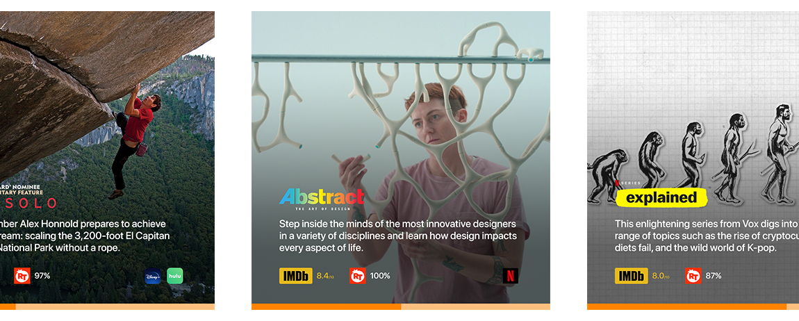
Instagram redesign: Article summary post #1
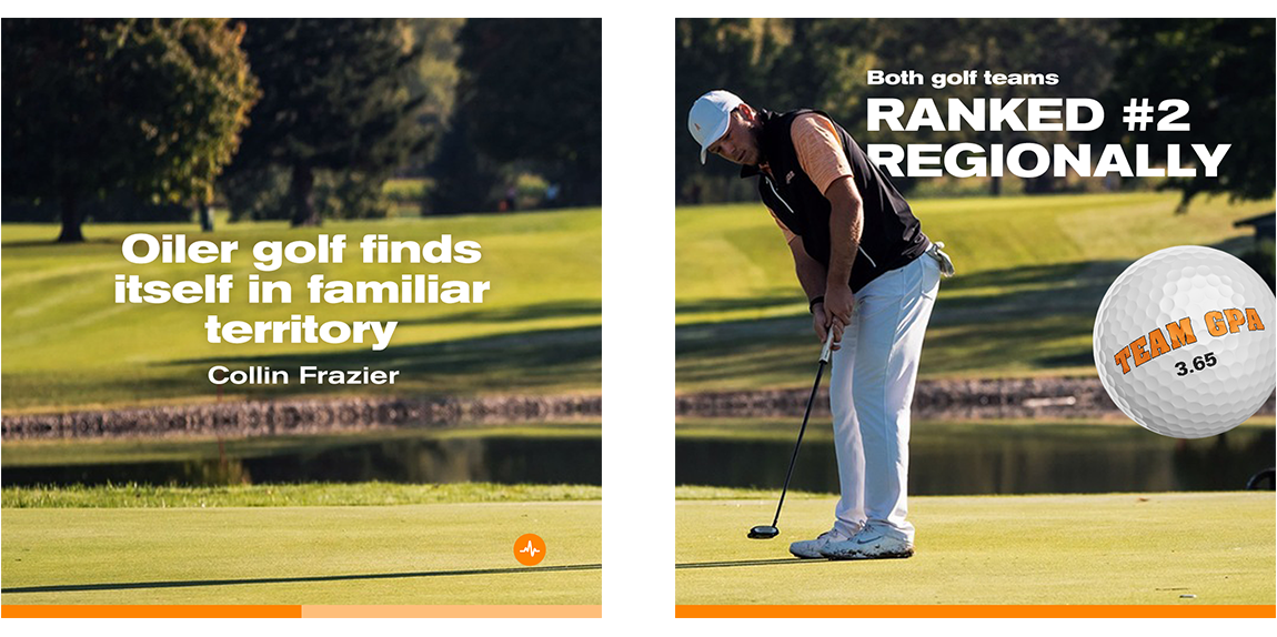
Instagram redesign: Article summary post #2
Instagram redesign: Holiday post

Instagram redesign: Event post
The main font used for the social media posts is Akzidenz-Grotesk Extended Bold, while the supporting sans-serif used for paragraph text is SF Pro Display.
Outcome
I was a part of The Pulse staff for almost two years, and during this time I was able to extensively familiarize myself with Adobe InDesign and expand my knowledge using the rest of the Adobe Suite. Additionally, I performed routine maintained on The Pulse's website, and experimented with WordPress theme creation.
Awards 

Ohio News Media Association
Design, 3rd

More case studies coming soon

Raven's Progressive Matrices
A cross-platform compatible software for solving a non-verbal fluid intelligence test.
UI Design / Front-end development / HCI Research
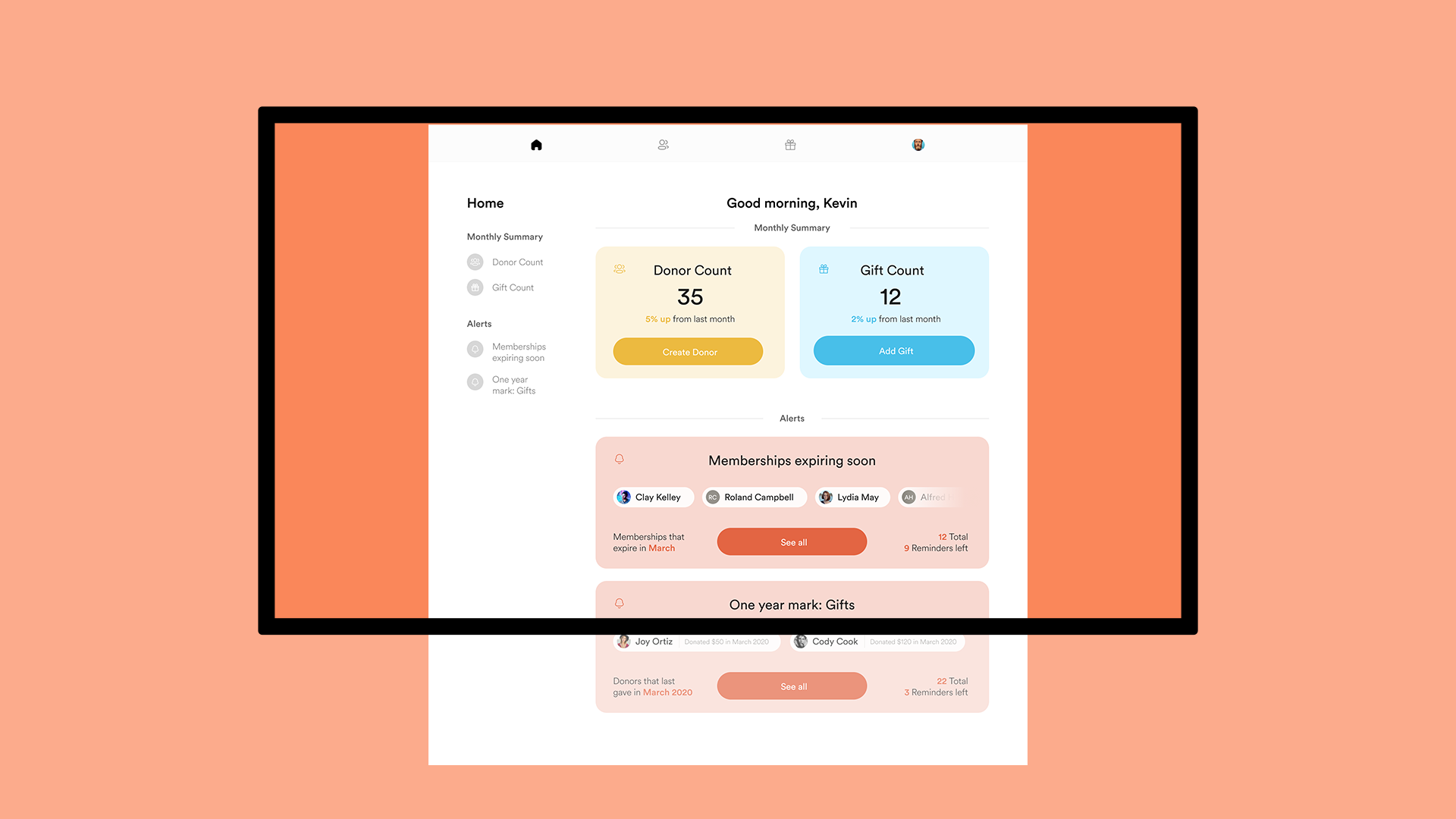
Donor Management Software
A Customer Relationship Management (CRM) solution for Wood County Humane Society.
UI Design / Front-end development / Back-end development
Say hi!
timotejiliev@gmail.comtimotejiliev
@gmail.com
I'm currently open for work and am looking for opportunities in front-end development and UX design.
Designed in Adobe XD. Developed with ReactJS.
© 2025 Timotej Iliev